


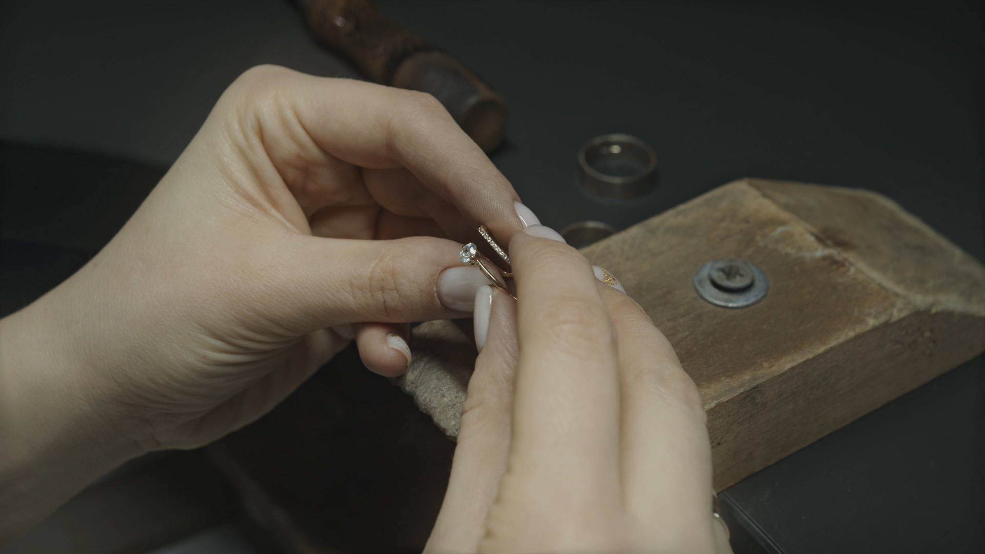
Silhouette
Every piece starts as an outline. We look for silhouettes that read clearly from a distance and reveal detail up close: a clean band, a decisive curve, a stone held at the right height.
Contrast
Polished against satin, light against shadow, fine against bold. Contrast gives a piece depth without adding weight.
Light
Stones and metal are there to catch and return light. Settings are designed to let light enter the stone, not to hide it behind excess metal.
Proportion
We measure proportion against the body. A ring must sit comfortably between neighbouring fingers; an earring must balance on the ear; a chain must fall in a considered line.
Texture
Surface matters. Finishes are chosen to age well and to be maintained, so that a piece can be refreshed rather than replaced.
The ivory and burgundy world
Our visual world pairs warm ivory with deep burgundy and black. It is the palette of candlelight and linen, of velvet and paper, and it frames jewelry without competing with it.
Classic and contemporary
We borrow the discipline of classical jewelry, its settings and its proportions, and apply it to contemporary forms. The result should feel familiar and new at the same time.
Fine jewelry and a quieter tension
There is a subtle edge in our work: a darker romanticism, a hint of street culture, a refusal to be merely pretty. It is never loud, but it is always there.
Details
The underside of a setting, the back of an earring, the finish of a clasp: the details nobody sees in a photograph are the ones the wearer lives with. We treat them accordingly.


